
POSTER AND MAGAZINE INFLUENCES

|

|

|

|
|
|
I really like this poster as it relates to the theme of the trailer we are going to create. As the trailer will be filmed in low key lighting, there will be a filtered hue in our images, just like the image from this poster. This poster has inspired us to do this. I also like the font used for the name of the movie, as it is similar to text seen on a digital device.
|
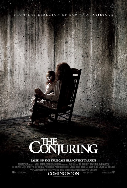
I love the simplicity of this poster, the face of the antagonist is hidden by a shadow/ where it faces into the black. As the eyes stand out it invited the apiece to look closer and see what is being advertised. I also like the title of the movie as it is using the technique type as image, making the 'r' mirror itself.
|
This is one of my favourite posters, as it is the most simple one out of them all. The textures used within this image is very appealing to me as the bandages connote venerability and mystery. Also bandages are most often associated with injury, so this would help to signify many different things to the audience. I am going to use this idea as inspiration for my posters that i will design.
|
Within this poster, unlike the others, I am very fond of the illustration used within it. Especially The red roots underneath the tree. I feel this would look very effective on my poster under the number 1 as it would signify the problem with the plot of the film.
|
I really like the shot used within this poster, as it is a long shot, to can focus on the subject in the middle. Also this gives room to add texture around the edge, creating a decomposing, rotten feel. I would really like to take aspects of this poster and include it within my own, however manipulate it to our story.
|

|

|
|
This magazine front cover is very simplistic, however creates such a huge impact. As this character is famously known to be the godfather, not much is needed to to be said. I would like to create the same effect and impact within my own magazine front cover. Also I am going to include the idea of 3 main clouds, black, white and green. This means the green will create a greater impact as it will stand out from the background.
|
I am very fond of this magazine layout. I like how it is tilted slightly to the left, making it unique from the normal layout. It makes the whole page more visually appealing and helps the subject in the foreground to stand out. Again only three colours have been used, which helps there to be harmony within the whole page.
|
DRAWN POSTER DRAFTS

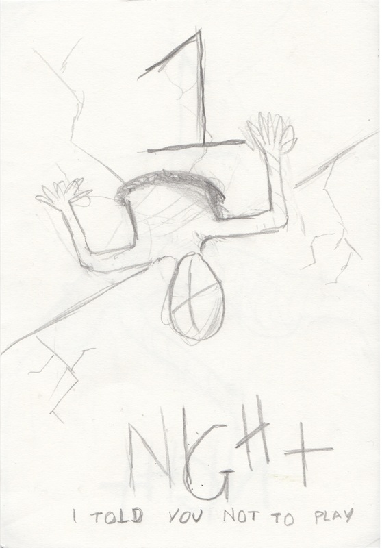
In the drawn draft of poster concept 1 I have drawn the character of Kylie floating in the air as if she is possessed. I have also tried to create the texture in the background of cracks in the wall. This is to give hints to the audience that the film takes place within an abandoned or rotten area/building. I also incorporated the number 1 from the title of the film into the cracks in the wall, connoting that only one will survive. You can see lines wrapping around her body within this illustration and this is going to be bandages as I really liked how this texture was used within the American Horror Story poster, I feel this creates an eerie atmosphere as the identity of the protagonist or antagonist is hidden. The name of the film (header) will be placed at the bottom as this came out as the most popular place for it to stand in the survey.
|

In the drawn draft of poster concept 2, I used the technique of morphing, to combine two images together, the two images i illustrated together were, the face of Kylie (the main character) screaming and the tops of trees seen within woods. I included these trees again to show the audience the types of locations this film will be based, the trees would connote isolation and loneliness. However i wanted the face to look slightly distorted, simular to the poster of the horror film 'Mirrors' . The title of the film was again placed at the bottom, and was written in a way which seems as if someone has carved out the letters, signifying that people have been trapped and are trying to leave a message. I also included a tagline within this poster 'i warned you not to play' which are the words someone tells kylie when entering this game/tv reality show. Also it seems as if the message is warning the audience, making them feel included within the story.
|
|

|
|
In the drawn draft of poster concept 3, I have drawn the protagonist, climbing out of the ceiling. I have done this as it would show the audience that the film's sub genre is supernatural, as the image shows the protagonist in a unusual situation. Also this would connote that someone is trying to escape, Again I used the texture of cracks in the wall to show the decomposition of the area. I am also incorporating the cracks into the number 1.
|
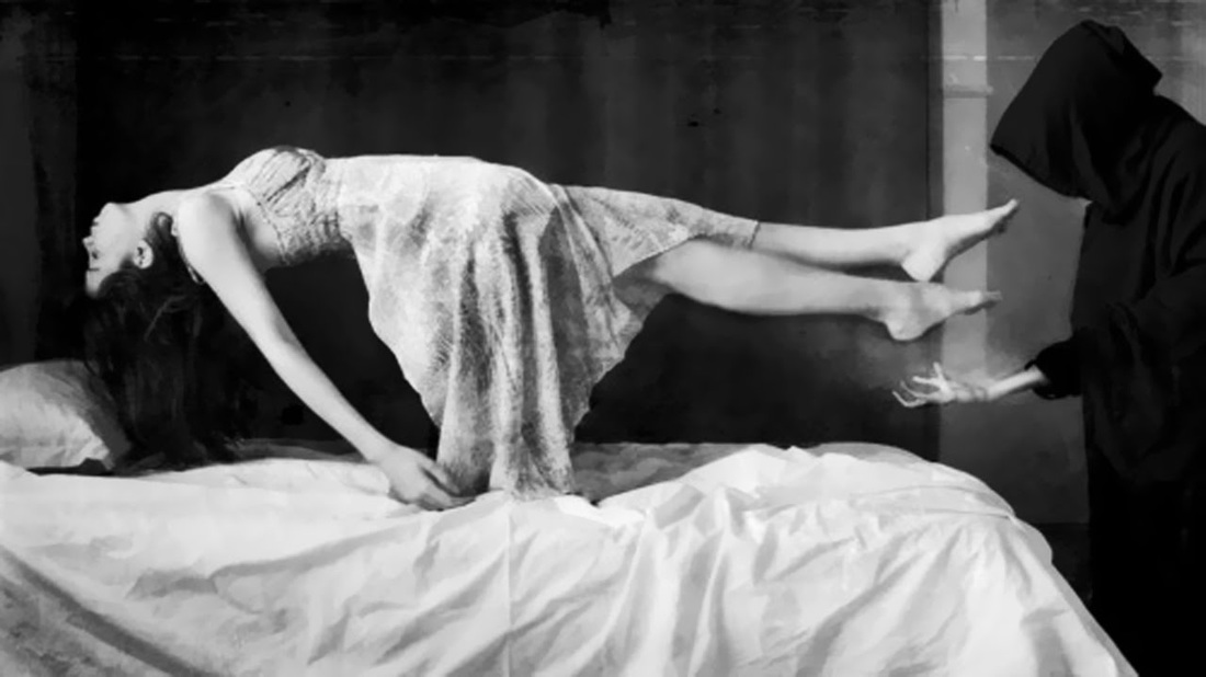
This drawn draft was inspired by two different posters 'AHS Roanoke' and 'the Conjuring'. Within our trailer, we have an idea for a scene where the protagonist approaches a being crying under a sheet, and when it is removed there is no-one under there.
|
EDITED POSTER DRAFTS

I designed this poster using Adobe Photoshop CC, after using the drawn draft as a guide i didn't change much. I kept the same format and am please of the outcome. If I do choose this design I will lay the actor on a chair or table and edit that away.
|

I am very pleased with the outcome of this draft. Again I used Photoshop and only took one stock photo from the internet. After this I changed the brightness and contrast I used the liquify tool to elongate her face and sharpen her teeth. I also used the scratched text again.
|
|

|
DRAWN MAGAZINE DRAFTS
|
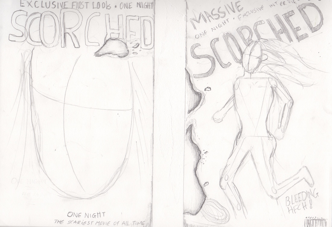
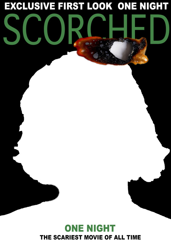
In Film Magazine front cover 1, firstly I decided to use the colour scheme of black, white and green. Even though I did not show this on the drawings It was discovered on the audience research to be popular, so I will be adding this in on the computer edits. We would use the accent colour of green as it is similar to the colour night vision creates, and as this film will be shot in low key lighting, this hue will be seen throughout it. The name of the magazine is called Scorched, and as this means burned, Liam adding sections of burned paper to the magazine to give the title more purpose. Also i have included many different aspects seen within a poster, such as tagline, and mastheads, as these were inspired by the magazines i have previously been researching.
|
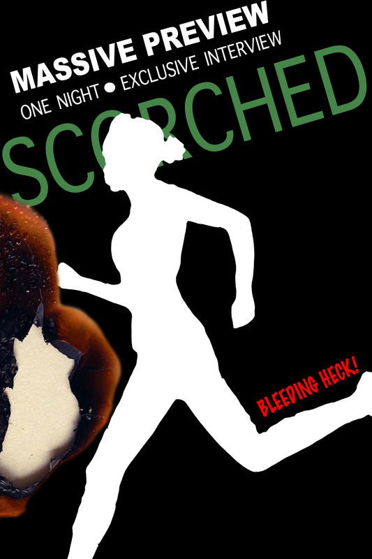
In Film Magazine front cover 2, I changed the layout slightly of the text. I made it tilted to be in harmony of the person running, making it look as if the text had movement. Again I used the effect of the paper burning, this time it was is if the page had caught fire from the edge. I am very fond of this effect however I don't know if it ruins the layout of the magazine. The person on the front cover would be the character Kylie, supposedly running away from the antagonist. I took the saying 'Bleeding Heck' from the empire magazine as I felt it was appropriate to my genre and theme of the movie. even though the colour scheme does not include red in it, I may have the saying "bleeding heck' in red, as it shows continuity.
|
EDITED MAGAZINE DRAFTS
|
|
|
This edit done on photoshop is very similar to the plan I drew out. Now I have added the colour the vision is starting to fall into place and I am staring to see what aspects work and what aspects do not work. Im not too sure whether I like the masthead being green. So when i come to creating the final design, I may just add a green hue to the image.
|
Within this developed edit I prefer the positioning of the burned effect, I also like how the image of the person running overlaps the title of the magazine. Im not sure about the red being incorporated into the poster, however if it is used in a subtle manner, I feel it could be effect.
|
Test Shots
We have taken practice images for our magazine and poster to see what type of lighting and shots work. We have used materials such as bandages as this would hint to the location of the film which is a house / abandoned mental asylum. Also this would cover the identity of the character making it seen more mysterious to the audience. We positioned our model in different ways which would look as if he was floating when edited in photoshop.
